Reports: Understand Your Calling and Voicemail Drop Performance
Last updated: August 21, 2026
The Reports tab brings your call and voicemail performance into one place, so you can move beyond individual activity and understand the bigger picture: how often your team is calling, how many prospects are connecting, when calls perform best, and which voicemails are actually driving callbacks.
Start with the right slice of your data
At the top of the page, you can choose the date range, account, and campaign you want to analyze. This makes it easy to switch from a high-level view of your calling activity to a specific campaign or account.

Dialer
The Dialer section gives you a complete picture of your calling activity, starting with the numbers that matter most.
The summary metrics show how much calling activity took place during your selected period and how that activity is performing.

You’ll see:
Calls Made — the total number of calls placed.
Connect Rate — the percentage of calls that resulted in a connection.
Avg. Call Duration — how long a connected call lasts on average.
Total Talk Time — the total amount of time spent talking to prospects.
Avg. Calls / day — your average daily calling volume.
Calls per Rep / day — the average number of calls made by each rep per day.
Together, these metrics help you quickly understand both activity and efficiency. For example, a high number of calls with a low connect rate may point to a targeting or timing opportunity, while a lower volume with longer conversations can indicate a different calling strategy.
Where available, percentage changes next to your metrics show how performance has shifted compared with the previous period, making it easier to spot whether things are trending in the right direction.
See how your calls are distributed
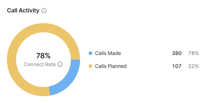
The Call Activity chart gives you a visual breakdown of your calling activity.
Here, you can compare calls made with calls planned to understand how much of your intended outreach is actually being completed. The chart also shows the overall connect rate, giving you a quick sense of how effectively that activity is translating into conversations.
This is particularly useful when you want to answer questions like:
Are reps completing the calls they planned?
Is our calling volume high enough?
Are more calls actually leading to conversations?
Understand what happens after the phone rings
The Call Outcome Breakdown takes you one step further by showing what happened to the calls that were made.
You can see how many calls were:
Connected
Not Answered
Busy
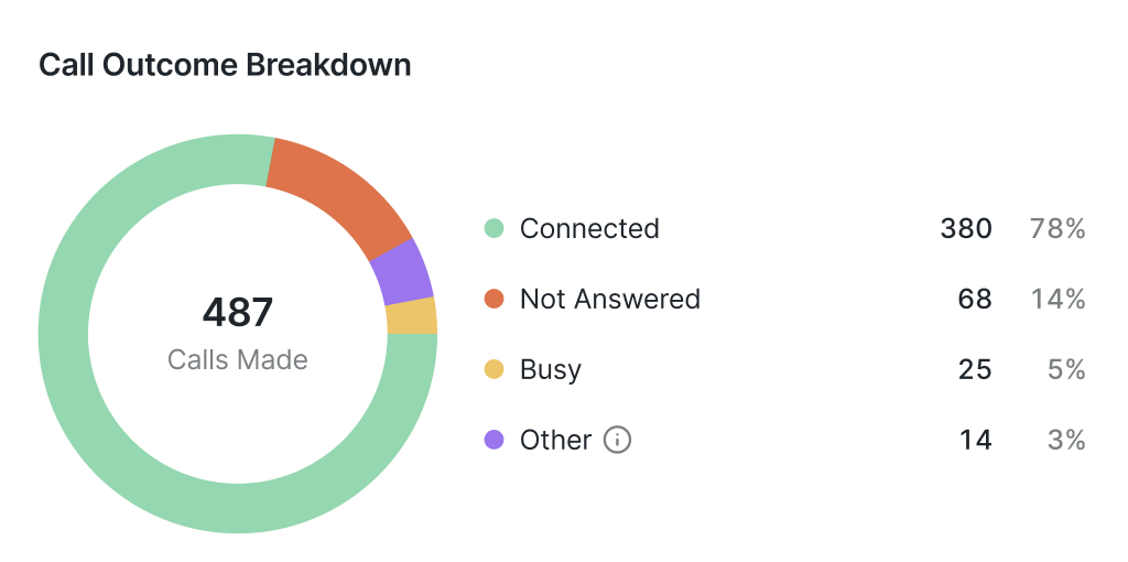
The Other category includes the calls that could not be completed due to issues such as insufficient funds, connection problems, or temporary service unavailability.
The breakdown makes it easier to distinguish between a problem with calling volume and a problem with reachability. If a large portion of your calls are going unanswered, for example, you may want to experiment with when your team calls rather than simply increasing call volume.
Find your best time to call
Not every hour is created equal when it comes to getting someone on the phone.
The Best Time to Call heatmap helps you identify when your calling activity and connections are concentrated. Darker cells indicate periods with more activity, helping you quickly spot patterns.
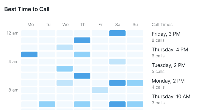
Use this view to identify potential calling windows and adjust your outreach accordingly. If certain days or times consistently stand out, your team can prioritize those periods instead of relying on a one-size-fits-all calling schedule.
Voicemail Drops
The Voicemail Drops section helps you understand what happens when a prospect doesn’t answer and, more importantly, whether your follow-up voicemails are generating responses.
Measure your voicemail strategy
At the top of the section, you’ll find several key metrics:
Voicemail Drops Sent — how many voicemails were delivered.
Callback Rate — the percentage of voicemail recipients who called back.
Callback Answer Rate — the percentage of callbacks that were answered.
Avg. Voicemail Drop Duration — the average length of your voicemail.
Avg. Callback Duration — the average length of answered callback conversations.

These metrics give you a fuller picture of voicemail performance. A strong callback rate tells you that your voicemails are prompting prospects to take action, while the callback answer rate helps show what happens once they do.
Watch voicemail delivery over time
The Voicemail Drop Delivery chart lets you see how your voicemail activity changes throughout the selected period.
You can compare Voicemail Drops Sent with Unique Prospects Reached to understand both the volume of your voicemail activity and how many individual prospects it reached.
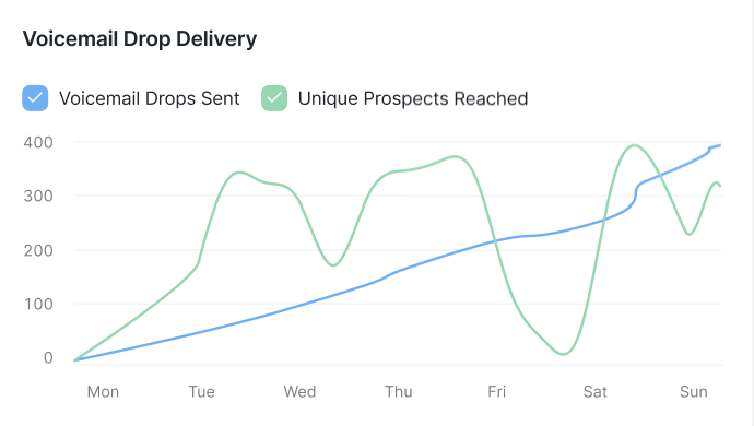
This can help you spot changes in outreach volume, identify unusually active or quiet days, and understand whether an increase in voicemail drops is also translating into broader prospect reach.
See what happens after a callback
Sending a voicemail is only half the story. The Callback Outcomes chart shows what happens when prospects respond.
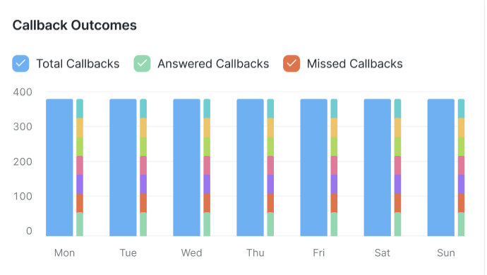
Here, you can compare:
Total Callbacks
Answered Callbacks
Missed Callbacks
The day-by-day breakdown makes it easy to see whether callbacks are being successfully picked up by your team or whether opportunities are being missed.
Good to know: An Answered Callback means the telephony provider reported that the incoming callback was successfully connected to the voicemail drop number’s forwarding number. It does not always mean a person answered or that a live conversation happened. A callback can still be marked as answered if it was picked up by voicemail, an automated system, or another connected endpoint.
When reviewing answered callbacks, check the Avg. Callback Duration or the individual callback duration. Very short calls can indicate that the callback connected but did not result in a meaningful conversation. If callbacks are not reaching the expected person, verify the forwarding number under Resources > Voicemail Drops > Numbers.
For example, if callback volume is increasing but missed callbacks are increasing too, your team may need to pay closer attention to callback coverage.
Find your top-performing voicemails
Sometimes the most useful insights are hiding at the individual campaign or voicemail level.
The Top 5 Voicemail Drops by Callback Rate table surfaces the voicemail drops that are generating the strongest response rates.
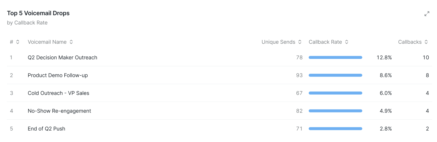
For each voicemail, you can see:
Unique Sends
Callback Rate
Callbacks
This gives you a quick way to identify which voicemail campaigns are resonating with prospects.
Find the numbers getting callbacks
The Top 5 Voicemail Numbers table takes the same idea down to the phone-number level.
It shows which individual numbers have generated the highest callback rates, alongside the number of voicemail drops sent and callbacks received.

Turn your reports into action
The Reports page is designed to help you move from “What happened?” to “What should we do next?”
Use the Dialer section to understand your team's calling volume, connection performance, outcomes, and the times when your outreach is most active. Then turn to Voicemail Drops to understand what happens when prospects don’t pick up.
Together, these views give you a clearer picture of your outreach performance and help you spot opportunities to call smarter, refine your voicemail strategy, and turn more outreach into conversations.